Static ad examples: make 1 frame carry the idea
Look at what the product shot and copy explain together. These examples show different ways to fit the idea into a single image.
Give the product a specific view
Choose the view around a question the image can answer. A worn piece, a fastening and a full product layout reveal different information.
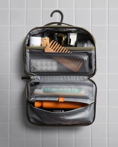
An open product explains its layout
Bellroy shows a hanging toiletry bag open, with items inside transparent compartments. The viewer can inspect the arrangement without a packing sequence.
What to look for: Which part of your own product becomes understandable when it is opened?
Try this: Put the opening view and the detail view in the brief as separate shots. Check whether the static view alone communicates the layout.
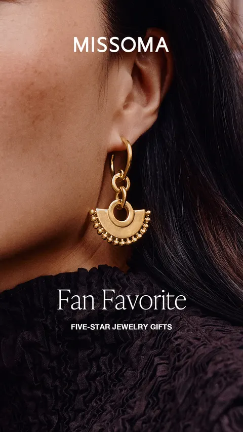
A wearing view gives the object context
Missoma shows the earring being worn, giving you a sense of how it looks beside the face.
What to look for: What familiar part of the scene helps a viewer relate to the object's size?
Try this: Specify the wearing view and verify the actual dimensions. A photograph cannot authenticate the metal or establish an exact scale.
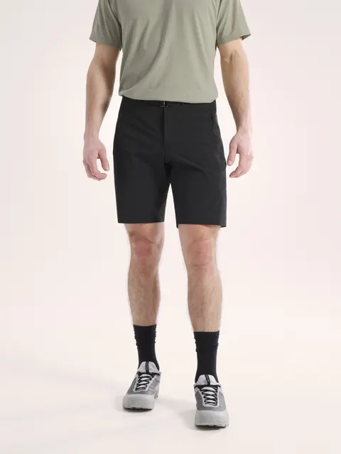
The outfit stays together in 1 view
Arc’teryx keeps the T-shirt, shorts and shoes in the image while the head is outside the crop. The visible clothing relationship is the subject.
What to look for: Which garment relationships must stay visible in your intended export?
Try this: Write the required coverage before choosing a crop. Capture your own full view so a later export does not lose the product detail.
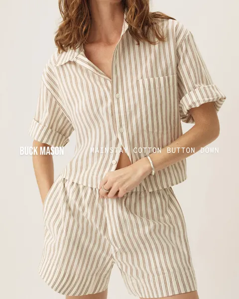
A closer view trades context for detail
Buck Mason shows a cropped striped shirt with the sleeve and fastening visible. The tighter view gives those details space while leaving the full outfit unseen.
What to look for: Does the brief need material and fastening detail or a full wearing view?
Try this: Ask for both when they answer different questions. Label the detail shot so the editor can find the intended view.
12 real image references across 11 brands. Compare product views, words and secondary images, then write the question your own brief needs to answer.
Make text and product share the frame
Text occupies image space. Decide which statement needs attention, then check whether the product and words are still readable in the final export.
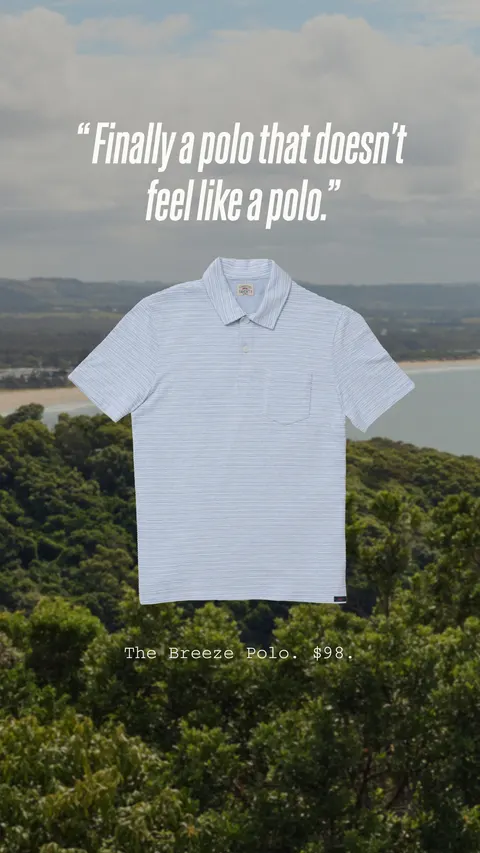
A short quote has a clear place
Faherty places a short quote above a polo over a landscape. The quote and garment have different areas of the composition.
What to look for: How much space does your approved statement need at the size someone will see it?
Try this: Test the actual copy in the planned layout before the shoot. Use your own verified customer evidence rather than copying another advertiser’s quote.
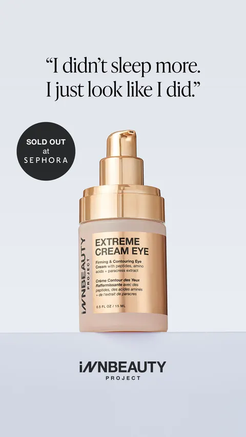
A quote and an availability badge do different jobs
INNBeauty gives a 2-line quote space above the product and separates the availability badge. Product, quote and retail cue remain distinct elements.
What to look for: Which element should a viewer notice first in your version?
Try this: Choose what people should notice first: the quote, product or availability. Keep the approved wording with the brief.
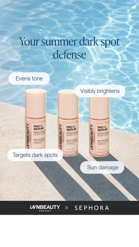
Callouts connect copy to particular products
INNBeauty gives each of the 3 products its own benefit callout. You can see which message belongs to which product. The claims still need their own support.
What to look for: Can the viewer tell which approved fact belongs to which product?
Try this: Give each callout a supported fact and a readable position. Review the actual export so arrows or text do not obscure the product.
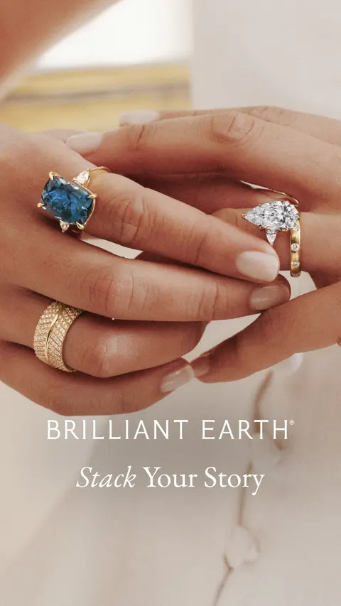
A headline interprets a wearing view
Brilliant Earth shows several rings on a hand, with Stack Your Story text. The line names a styling idea that the wearing view helps illustrate.
What to look for: Does your headline describe a relationship the picture actually shows?
Try this: Pair the proposed line with your own image before approval. Appearance alone does not verify metal, gemstone or craftsmanship claims.
Compare views without losing the subject
Insets, lineups and collages can answer more than 1 question. Each extra view needs a reason to be there.
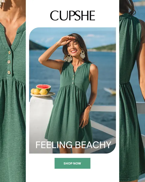
Detail crops support a central view
Cupshe puts a person wearing a dress in the middle and garment details on either side. The layout offers a full view and closer inspection in the same image.
What to look for: Which extra detail is worth the space it takes from the main product view?
Try this: List a job for each crop. Keep enough room for the main garment to stay recognizable at the final size.
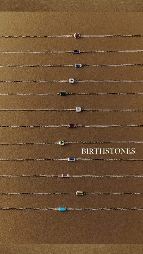
A lineup lets the viewer compare choices
Gorjana arranges necklaces in horizontal rows, with colored stones and a birthstone label identifying a selection.
What to look for: Which differences must remain visible for the choice to be understandable?
Try this: Keep the comparison consistent in your own shoot. Review stone or color descriptions against the actual products instead of guessing from the reference.

A collage connects products and styling
Mejuri combines product shots, worn jewelry and outdoor images in a gifting collage. Some images show the pieces closely, while others set the mood.
What to look for: Does your brief need a styling idea, a product detail or both?
Try this: Name which image carries each job. A collage that repeats the same information may make the product harder to inspect.
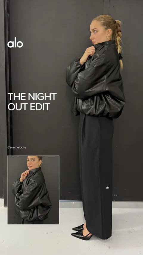
An inset offers a second framing decision
Alo shows a full-length outfit with a smaller outfit inset. The main view and inset make 2 camera distances visible in 1 creative.
What to look for: What does the smaller view add that the main view cannot show?
Try this: Choose the extra view around that answer. Keep your own garment, styling and production choices attached to the brief.
This is a selected composition study, not a ranking or a representative market survey. Public images do not establish campaign results.
An image ad has 1 frame to do the job
These image ad examples are static compositions. Compare which job leads: identifying the product, explaining a detail, carrying an approved statement or showing a styling relationship. A readable image is an observable design choice. It does not establish the advertiser’s outcome.
- Choose a main product view from the existing studies and write what must remain recognizable at the intended size. Use an inset only when it supplies a distinct detail.
- Choose 1 approved message and decide where it belongs. Keep a quote’s attribution, a product statement and an offer separate rather than assuming every visible line is verified evidence.
- Brief the image, text space and destination as one composition, then review your own export at final size. If the required information cannot stay readable, remove a secondary cue or make a different original concept.
Use what you noticed to write the brief
- Choose 1 question, such as product recognition or text readability. Record which reference makes that question concrete.
- Separate the image, statement and destination into their jobs. Use your own product facts, customer evidence and approved offer.
- Ask for the views and text space the designer needs. Keep each alternate concept tied to its own reference and version.
- Review the actual export at its intended size. Use your own test and baseline before calling any layout successful.
Keep a small reference set with the assignment
Collect the useful choices on the Infinity Board. Barry Pro lets you save a selected set to a named board and share it with your team on desktop. The reference set supports the conversation. Your own approved brief and production files carry the assignment.
Planning notes: Compare what a layout makes visible
Compare what a layout makes visible
Original composition notes explain the trade-off behind the existing gallery groups. They describe planning choices without recreating advertiser assets.
- Product first
- More space for the object. Less room for explanation. Check whether the feature is visible.
- Explanation first
- More room for approved words. Less product scale. Check readability at feed size.
- Product + detail
- A second view earns its space only when it reveals something new.