Instagram Story ad examples: make each frame understandable
Look at how the product, copy and next step fit into a vertical frame. These historical examples can help you plan your own Story ad.
Read the frame before planning the timing
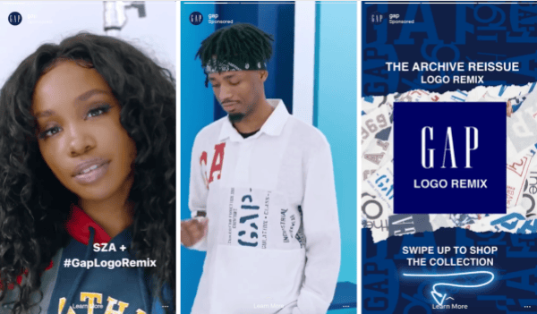
A portrait, a product and a shopping action
Meta’s 2018 illustration puts 3 panels side by side: SZA with Logo Remix text, someone wearing a Gap shirt and a closing panel with shopping copy. We can follow that message order, but this image doesn’t show the original timing.
What to look for: What new information does each panel introduce?
Try this: Assign a separate job to the opening, product view and action. Keep your own message and destination consistent.
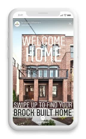
A home message stays inside the phone frame
The producer’s montage shows home exteriors, interior details, short lines of text and a swipe action inside the phone frame. The source identifies it as a Stories project, but doesn’t show where every original ad starts and ends.
What to look for: Which product detail must remain understandable in a full-screen composition?
Try this: Shoot your own whole product view and detail view. Review text against the platform interface before export.
Compare 2 documented 2018 Instagram Story projects, then plan the frames, message order and destination for your own ad.
Read the frame before planning the timing
A vertical image can look like a Story ad without proving where it ran. For these examples, we have source pages that identify the placement. Gap is the 3-panel illustration in Meta’s February 2, 2018 announcement. Rearview’s October 16, 2018 case describes 2 single and 2 carousel units for Brock Built. We can study the composition and displayed message order, but these sources do not recreate the timed ads.
Give the opening 1 understandable job
Gap introduces the collection with a portrait. Brock Built starts from the homes. Decide what someone needs to recognize in your own opening, then give the first frame room to do that. Adding another line won’t help if the main idea is still unclear.
Carry the same promise to the destination
Write the CTA beside its destination. If the ad invites someone to browse a collection, open that collection. If it promises a closer look at the layout, show the layout there. Check today’s placement specs and interface before using these older ads as a guide.
An original 3-beat Story assignment
For a 3-compartment pouch, open with the cable, comb and bottle beside the product. Show the packing action continuously. Close on the same visible layout with See the layout. We invented the pouch for this exercise. Before you film your own version, check that the actual product fits the items shown. The editor checks that text and hand movement remain readable in the intended export.
Use the worksheet
The completed example separates what we can see in the ads from our own plan. Use the blank worksheet for your product details, supporting sources and the people reviewing the work.
Start with the blank worksheet, or read the filled-in example to see how to use it. You can copy either one.