Black Friday static ads: layout and message hierarchy
Put the product, offer and brand in an order that's easy to read. These 2025 examples show a few ways to do that. Use the worksheet to plan your own layout and current offer.
Compare the creative choices
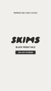
Members-only access and the sitewide offer
SKIMS puts Members Only Early Access above its wordmark and 30% off sitewide. The access rule is part of the main message instead of being left for someone to discover after clicking.
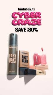
A Cyber Craze offer above the products
Huda Beauty leads with Cyber Craze and Save Up To 80%, then shows the products below. The offer gets most of the attention, with a separate area for the products.
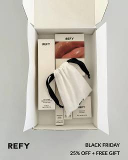
A bonus product made visible
REFY shows the products together in an open box, with Black Friday 25% off plus free gift along the bottom. The gift message sits beside the product photo, though the full purchase conditions need the source terms.
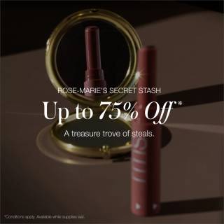
A quiet product view beside promotional language
rms beauty leaves space beside the products for Up to 75% Off. The reflection adds depth without putting the offer over the product detail.
A product lineup between the headline and action
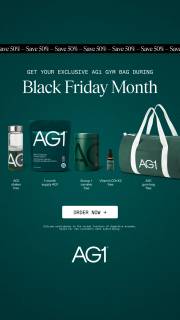
AG1 places Black Friday Month above a horizontal lineup of products and a gym bag, with Order Now in a separate button below. The lineup sits between the event message and the action, so the products have their own area rather than sharing space with every line of text.
What to look for: What does the viewer read first, second and third?
Try this: List the product details and offer terms that must stay visible in each size you make.
Decide which element should be read first
Choose what someone should notice first. SKIMS gives space to members-only access, Huda Beauty leads with Cyber Craze, and REFY puts the products beside the offer. Build the layout around that choice. Making every headline, product and badge bigger won't give the ad a clear order.
Use contrast to create a sequence within 1 frame
Use size, contrast and spacing to guide the eye. rms beauty keeps the offer clear beside the products. REFY gives the open box more room. Check your layout on a phone. If the product gets lost, give it more space. If an offer condition disappears, simplify the surrounding elements.
Preserve the whole composition when adapting dimensions
Make a layout for each size instead of cropping the middle of a portrait ad. Keep the product, offer, brand and important conditions visible. Rearrange your own assets for the new frame. The gallery shows individual stills, so use each one as a layout reference rather than a carousel plan.
Tell the designer what comes first
Tell the designer what comes first, what product detail matters and which condition must stay readable. Supply the product photo and offer text separately. Compare 2 layouts without explaining them to the reviewer. If they can't identify the product and offer, revise the layout before launch.
For the water-bottle graphic, put the product photo, planned 20% offer and eligibility line in the designer's brief as separate items. Ask for the bottle shape first, the offer second and the condition third in the reading order. Compare a bottle on a plain background with the same bottle beside an offer card. Keep the cap and base visible in both. Make the square layout separately from the portrait version so neither depends on cutting off the product. Then show the exports at phone size without talking through them. Ask the reviewer to name the product, discount and condition. If they miss something, revise that part of the layout before choosing a version.
Use the worksheet
The completed example separates what we can see in the ads from our own plan. Use the blank worksheet for your product details, supporting sources and the people reviewing the work.
Start with the blank worksheet, or read the filled-in example to see how to use it. You can copy either one.