Black Friday premium brand ads: preserve product identity
Look at how these 2025 beauty ads fit the sale message around the products. Keep the details people recognize, then give the offer a clear place in your own layout.
Compare the creative choices
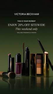
A product group with a weekend offer
Victoria Beckham Beauty puts Enjoy 20% Off Sitewide above the products. This Weekend Only appears in smaller type, keeping the time condition with the saving.
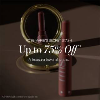
A quiet product view beside promotional language
rms beauty leaves space beside the products for Up to 75% Off. The reflection adds depth without putting the offer over the product detail.
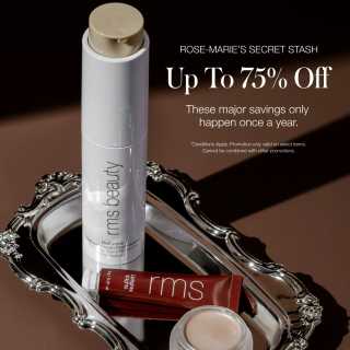
The up-to qualifier stays with the number
rms beauty puts Up to 75% Off and a once-a-year statement above the products. The close view keeps the products recognizable. The frequency claim comes from the advertiser.
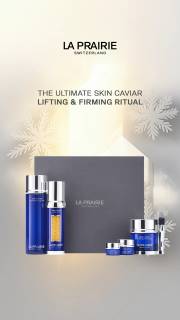
Gift presentation without a percentage
La Prairie shows products around a gift box under a skincare-ritual heading. The image presents a gift without a clearly readable sale percentage.
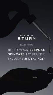
A dark product silhouette around a restrained offer
Dr. Barbara Sturm frames the central message with a silhouetted hand and dropper against a dark background. Build Your Bespoke Skincare Set is larger than Receive Exclusive 25% Savings below it. The white wordmark and product-selection message stay distinct from the discount, offering a reference for fitting a promotion into a restrained visual style.
What to look for: Which product and identity cues remain visible beside the promotion?
Try this: List the product and brand details people should recognize, then leave clear space for the confirmed offer.
Describe premium cues without inventing their effect
Look at what keeps the products recognizable beside the sale message. Victoria Beckham Beauty uses a dark setting and an orderly product group. rms beauty uses reflections and serif type. La Prairie shows the products with a presentation box. These are visual choices to study. The stills don't tell us how a discount affected brand value or willingness to pay.
Decide which identity cues survive the sale treatment
Decide what needs to stay familiar when you add the offer. It might be the product shape, label, colors or wordmark. Give the discount a clear place without covering those details. Check your draft against your own approved brand assets before comparing it with another advertiser's layout.
Read the exact offer and conditions
Read the offer as carefully as the photography. Victoria Beckham Beauty shows a sitewide percentage and a time condition. rms beauty uses an up-to offer. La Prairie's selected gifting frame has no readable percentage. Keep those differences when taking notes. Similar styling doesn't mean the brands are making the same offer.
Check product recognition and offer clarity
Check the product and offer separately. Can someone recognize the product? Can they explain the discount and its condition? If the photo loses its important details, reduce the competing elements. If the terms are hard to read, move or resize them. Use your own product assets and current offer for the final layout.
For the product brief, give the designer the approved product photo, brand colors, label and wordmark before adding the event wording. Ask for 2 text sizes beside the product while keeping the photo unchanged. This gives the reviewer a clear comparison: can they recognize the product and read the same offer in each version? Show both at the smallest intended size. If the larger headline competes with the label, adjust its position instead of shrinking the product. If the smaller headline disappears, give it more space or contrast. Record the chosen file and current offer together so the final export carries the reviewed wording. The exercise checks recognition and legibility without predicting a change in brand value.
Use the worksheet
The completed example separates what we can see in the ads from our own plan. Use the blank worksheet for your product details, supporting sources and the people reviewing the work.