Black Friday beauty ads: keep the product visible
Can someone recognize the product before reading the discount? We compare Black Friday 2025 beauty ads that show products, open formulas and sets, then turn those details into a shot list. The pictured offers are historical.
Compare the creative choices
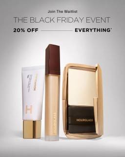
A coming event and waitlist action
Hourglass places its Black Friday event and 20% off everything message above a few upright makeup products. Join the Waitlist remains at the top, connecting the discount announcement with an access action.
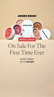
Open products with a first-sale message
Jones Road shows open products above On Sale for the First Time Ever. Black Friday and up to 20% off appear below, so the first-sale message comes before the discount.
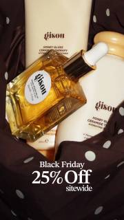
Products arranged for inspection
Gisou shows the products in close-up. Black Friday 25% off sitewide sits below, keeping the promotional text separate from the detailed product photograph.
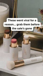
A value message in bold display type
OGEE puts the sale message over a group of products and asks people to shop before they sell out. Use the relationship between the words and products as the reference. The popularity claim comes from the advertiser.
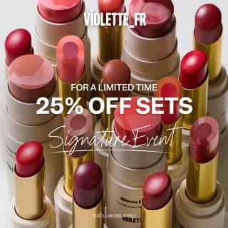
Open lip colors around a set offer
Violette fills the frame with open lip products in several shades and places 25% Off Sets over them. The exposed colors show a product detail that closed packaging would hide, while Sets limits the offer wording. The frame alone does not establish which pictured shades belong to each set.
What to look for: Which product detail helps explain the beauty assortment?
Try this: List the label, shade, applicator or open-product detail the photographer needs to keep visible.
Plan the product shot
Choose what the product shot needs to show. Hourglass shows the products beneath its event message. Jones Road opens the products so the colors are visible. Gisou uses a close product arrangement, while OGEE groups products on a table. Decide whether your shot needs to show the name, shape, color or set contents before adding props.
Show the product closed and open
A closed product view can show the name and shape. An open product view can show the color or surface. If both won't fit clearly beside the offer, make separate versions. Check that someone can identify what each image shows. A visible texture or color still needs separate support for any benefit claim.
Leave room for the offer
Leave space for the offer when planning the photo. Gisou puts the discount below the products. OGEE places its sale wording above the group. In your layout, check that text doesn't cover the label, applicator or open product detail. Review the final crop on a phone.
Tell the photographer what the shot must show
Tell the photographer which details must be visible, such as the label, applicator, open product or complete set. Confirm the exact shade and product version before the shoot. Keep approved benefit copy alongside the shot list. A strong photo still needs to show the right product and the detail the ad talks about.
The product brief asks for a whole view and a close-up. Give that list to the photographer before choosing the background. Leave clear space for the offer so it doesn't cover the product or its label. Have the product owner confirm that the photos show the correct product. Then compare the clean image with the sale layout at phone size. Can someone still identify the product and read the offer? If the headline hides either, move the text or use the other view. These photos show the product's appearance. They don't establish how well it works.
Use the worksheet
The completed example separates what we can see in the ads from our own plan. Use the blank worksheet for your product details, supporting sources and the people reviewing the work.
Start with the blank worksheet, or read the filled-in example to see how to use it. You can copy either one.