Black Friday Facebook ads: creative examples and planning
What should someone notice first: the product, the discount or the reason to shop now? We use Black Friday 2025 ad examples to help you make that choice for your own Facebook ad. These Meta Ad Library records do not confirm Facebook placement or campaign results.
Compare the creative choices
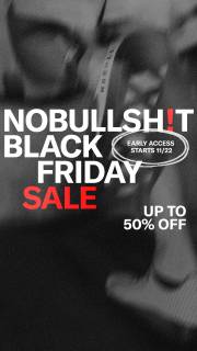
A sale headline over a close torso crop
NOBULL makes Black Friday Sale the main message over a close crop with a measuring tape. Early access gets a smaller date badge, and Up to 50% Off sits below. Notice how the event, date and discount each have their own place.
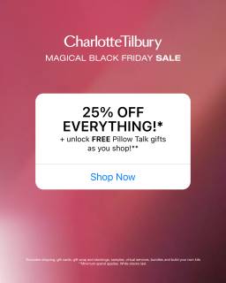
A compact event, offer and action card
Charlotte Tilbury groups 25% off everything, a smaller free-gift line and Shop Now inside one panel. The offer and action are together, so the viewer doesn't have to look elsewhere in the image for the next step.
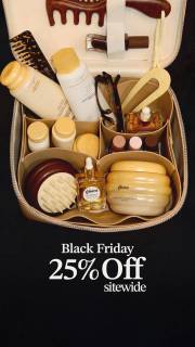
A product arrangement around a Black Friday offer
Gisou shows the products together in an open bag above Black Friday 25% off sitewide. The product photo explains what the sale is about before the offer line below it.
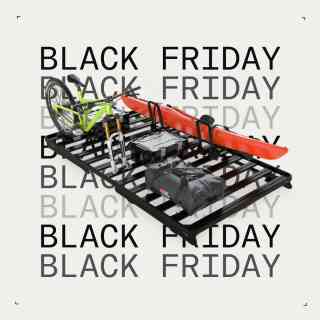
Product silhouette across an event wordmark
Dometic puts the roof rack across repeated Black Friday text. The product stands out against the background while the event name stays visible around it. This is one still from the record, not the carousel order.

The offer above the product range
MANSCAPED puts Black Friday Sale and 25% Off Sitewide above a fan of grooming tools. The event and saving are readable before the viewer looks through the different products. This is a useful reference when the first message is the offer and the product group explains what it covers.
What to look for: What message would a viewer understand before opening the destination?
Try this: Choose the question your own ad needs to answer first: what is on sale, whether the product suits the shopper or why they should act now.
Start with the buying question
Decide what the ad needs to show first. NOBULL leads with Black Friday Sale, Charlotte Tilbury puts the offer and Shop Now together, and Gisou shows the products above the discount. For your own ad, choose the product, the offer or the reason to shop now as the lead. Give the other details room without making everything compete.
Separate the offer from the creative format
The offer and the layout are 2 separate choices. Dometic puts its product across repeated Black Friday text. Gisou gives the product photo and offer their own space. You can study those layouts without using the same discount. Start with your actual offer, then choose how to show it.
Build a small comparison with one clear variable
Make 2 versions of the same product and offer. Put the product first in one and the offer first in the other. Keep the dates, eligibility and landing page the same. Write down what you want to learn before launch, then use your own results to compare them.
Give the editor what they need
Give the editor your product photo, offer, exclusions and landing page together. Point out the line and product detail that must stay visible. Check the export at phone size with the platform interface over it. Keep the reference beside the brief to explain the layout idea, then make the ad with your own assets.
For the product brief below, give the designer the same product photo for both versions. In the first, make the packed pouch the main thing someone sees. In the second, lead with the planned 20% weekend offer. Keep the 3 props, eligibility line and landing page the same, so you're comparing the first message rather than a different product setup. Tell the editor to keep the zipper and compartments visible in both exports. Show each version to someone without the brief and ask what is on sale and what they would click for. If the offer version hides how the pouch works, move the text before making more sizes.
Use the worksheet
The completed example separates what we can see in the ads from our own plan. Use the blank worksheet for your product details, supporting sources and the people reviewing the work.
Start with the blank worksheet, or read the filled-in example to see how to use it. You can copy either one.